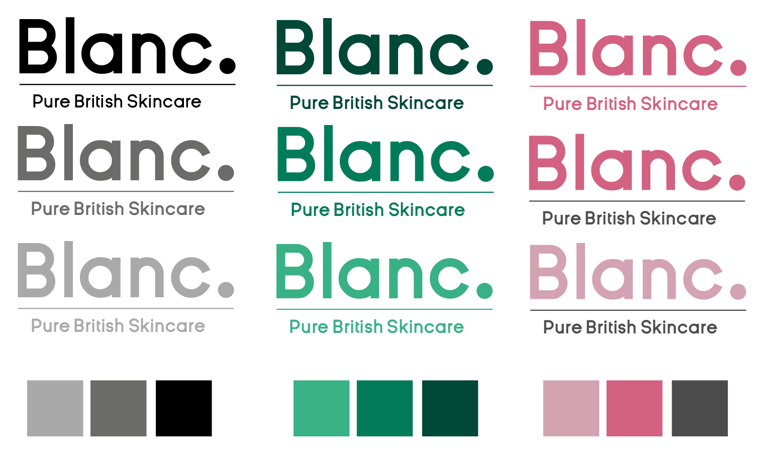
Moodboard:
Very clear, punchy and vibrant images which is what I want to express through this concept. A bold, clean typeface which stands out, is easy to read and is what the brand is. Clear of any chemicals, what you see is what you get.

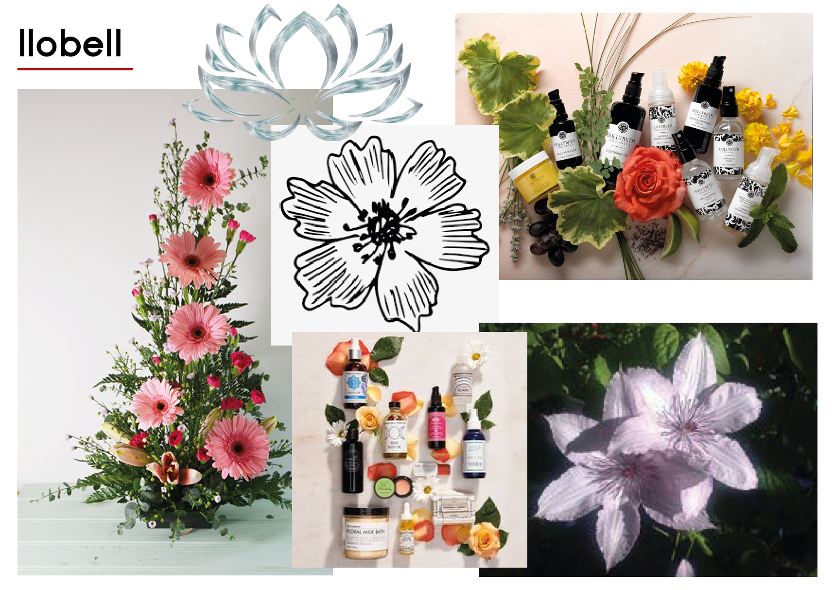
Moodboard:
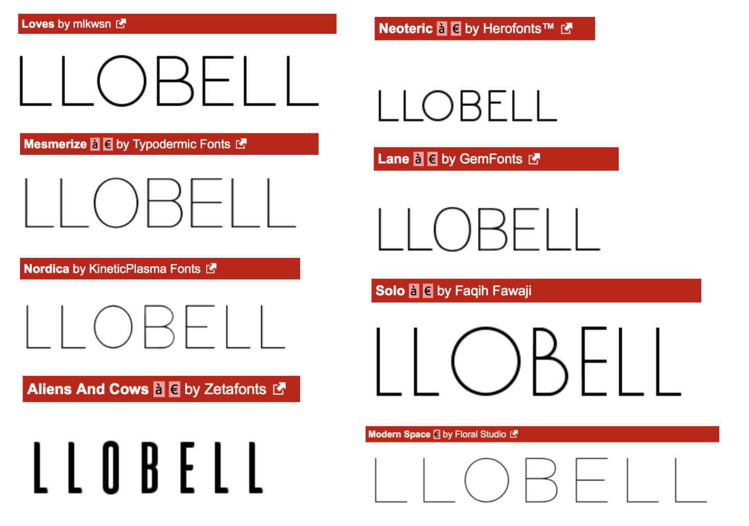
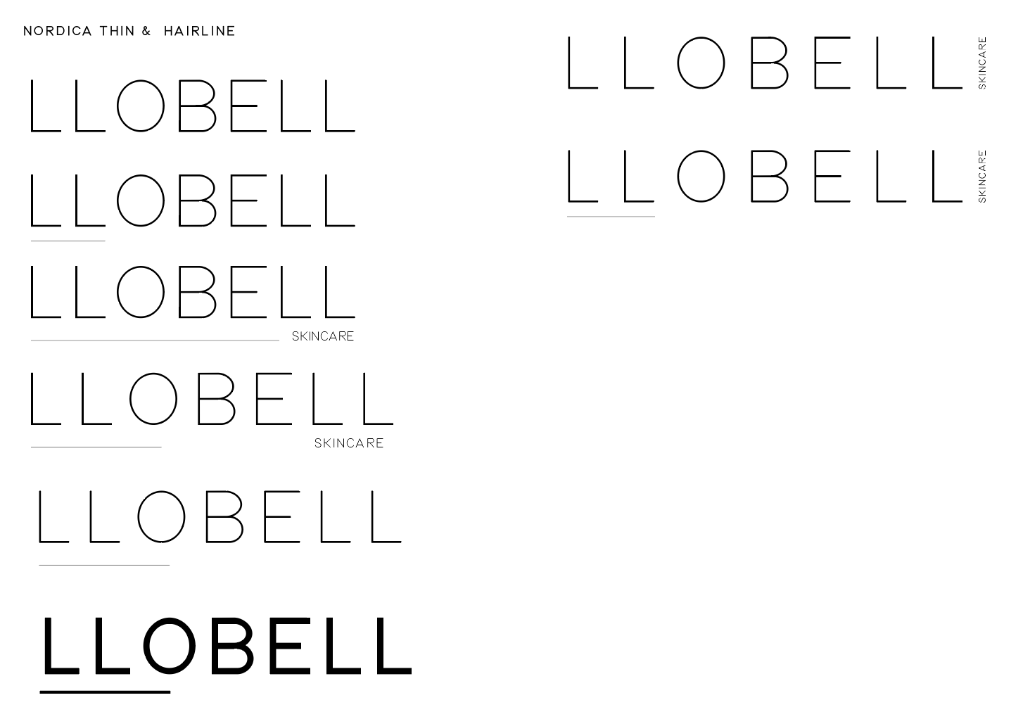
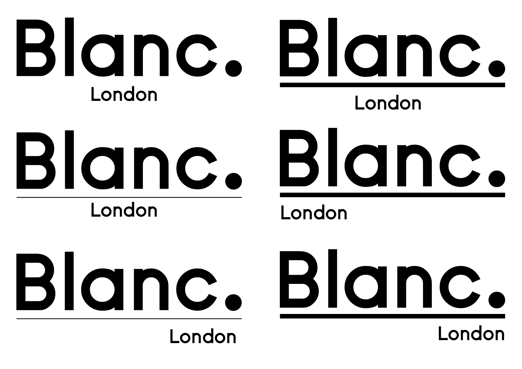
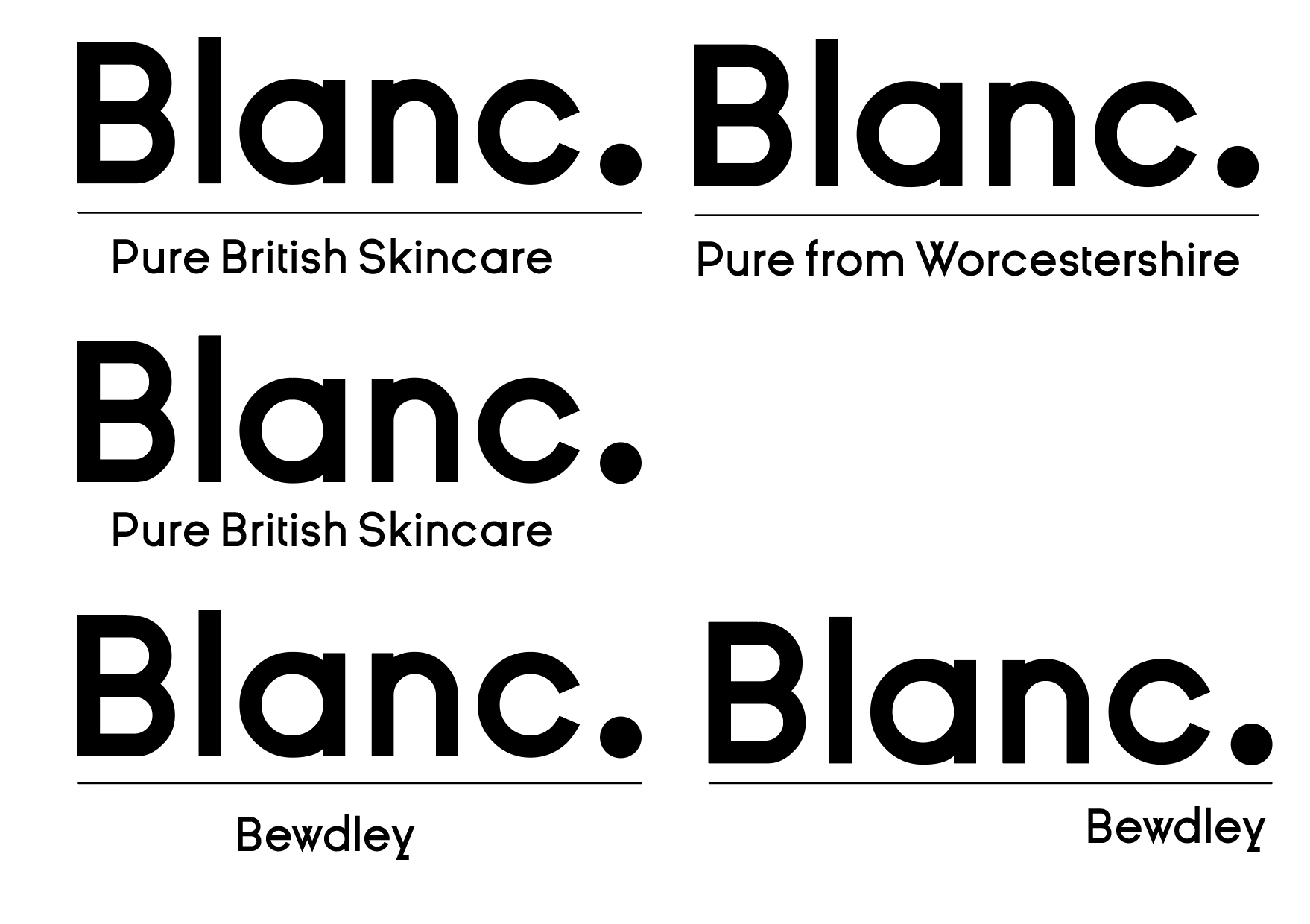
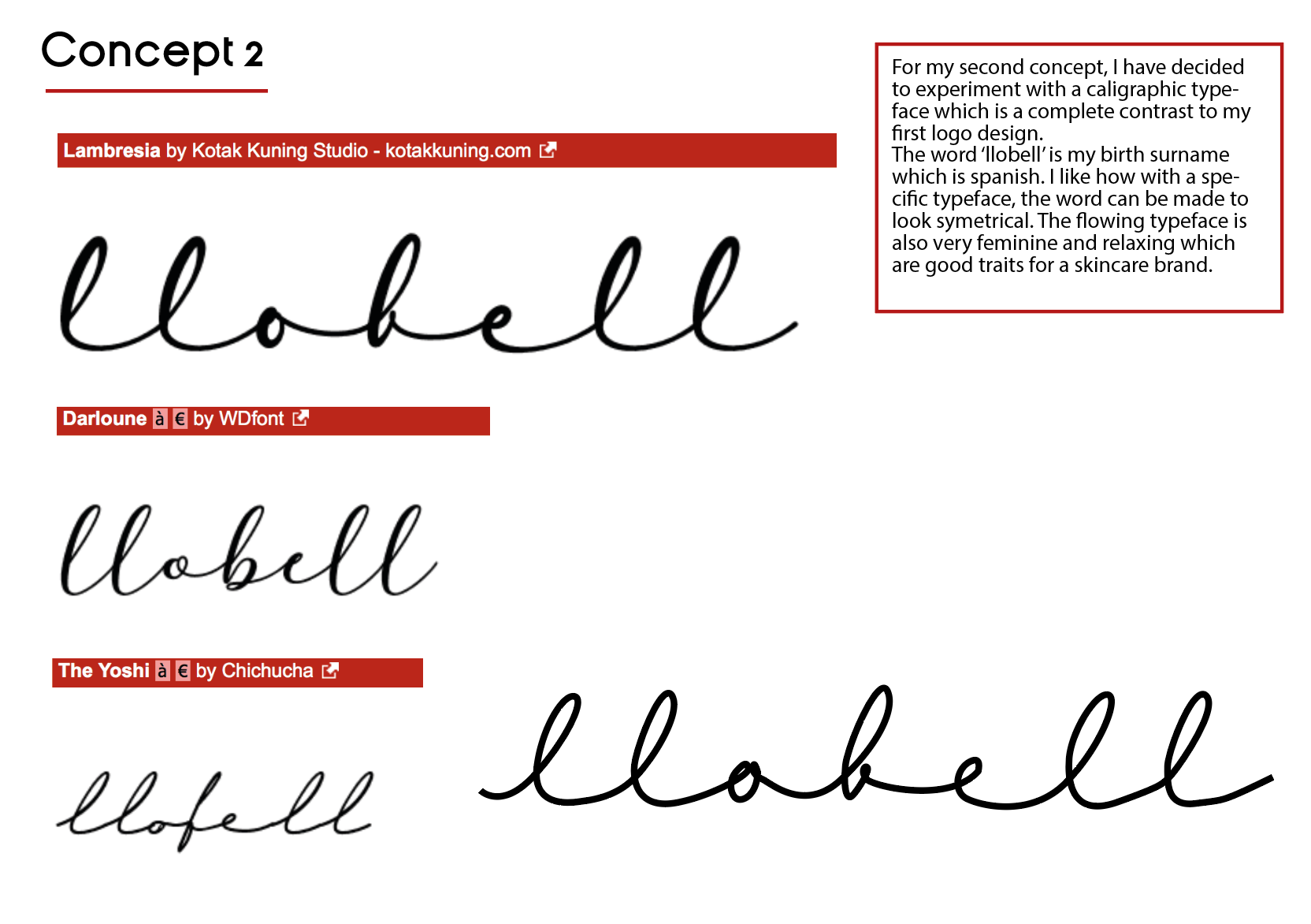
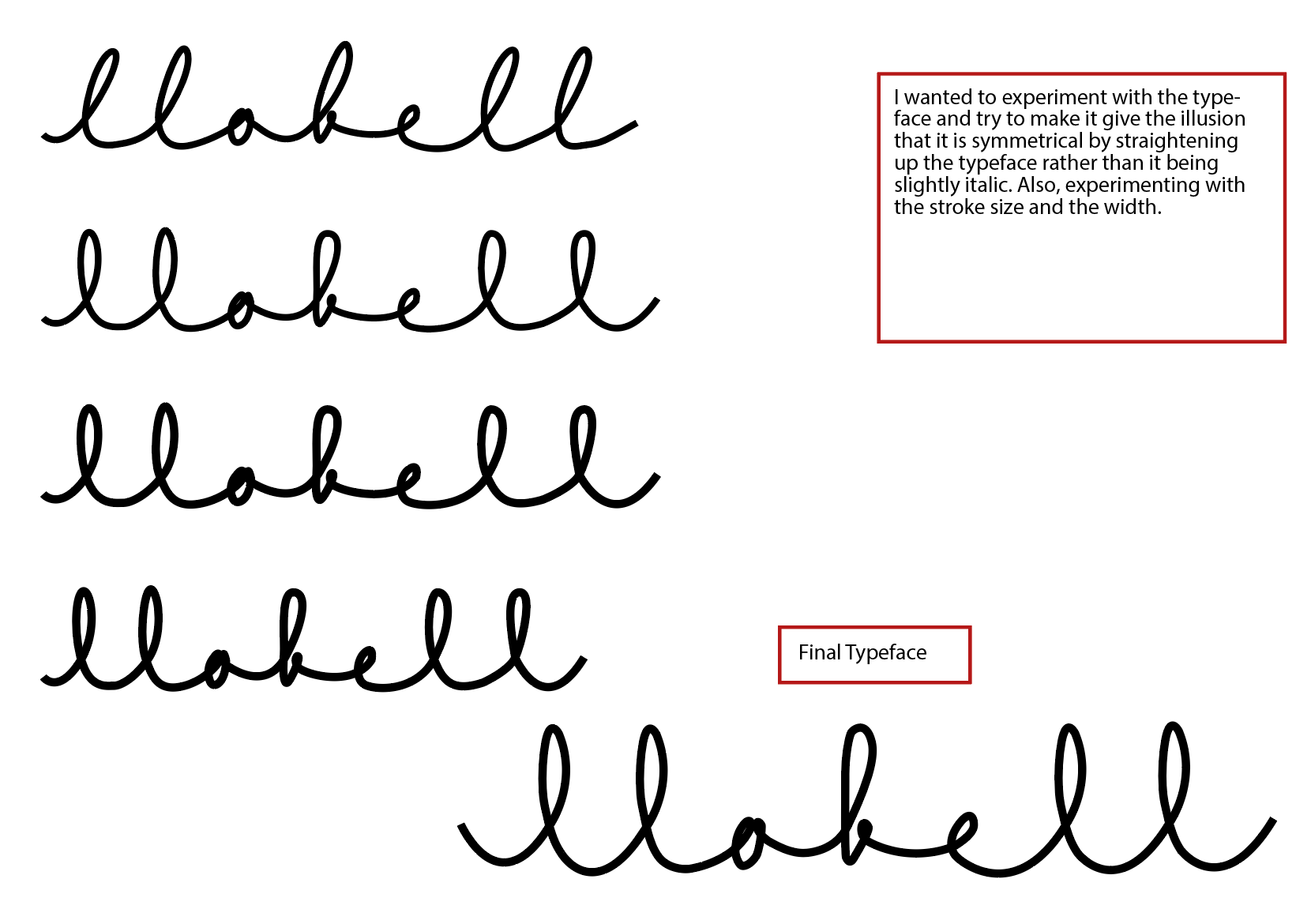
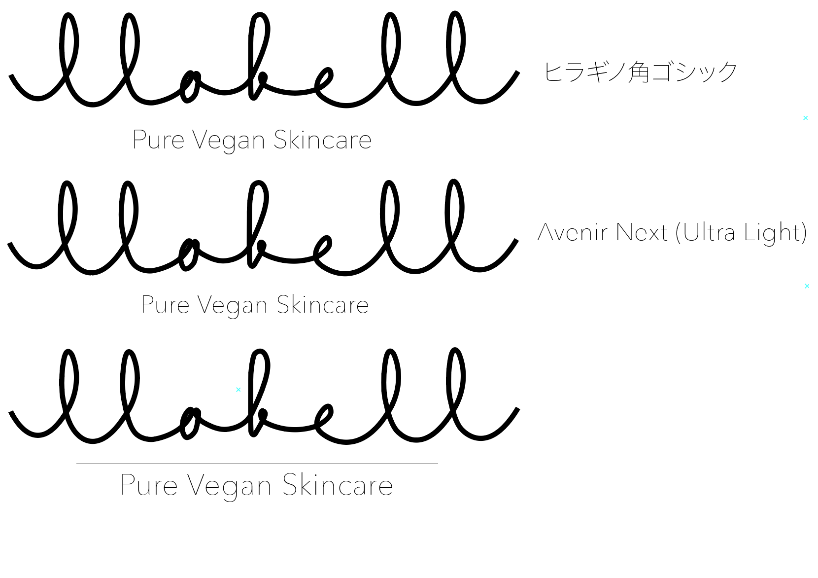
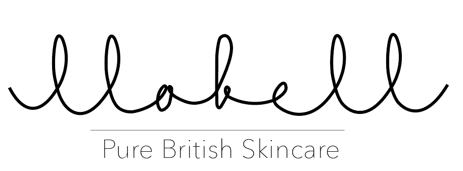
I really like the (almost) symmetrical name and want to emphasise on this.
"Symmetry has proven to be very appealing to the human eye. In nature, we enjoy the beautiful symmetrical colors on butterflies and the radial symmetry of flowers."
Hannah Kowalczyk-Harper, 'When to Use Symmetry & Asymmetry in Web & App Design', 2016
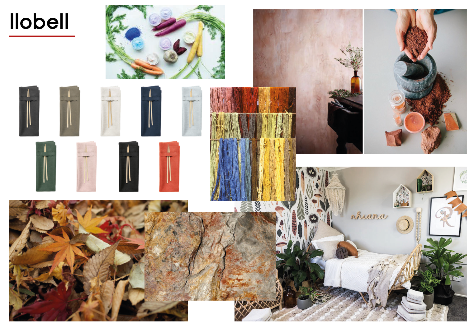
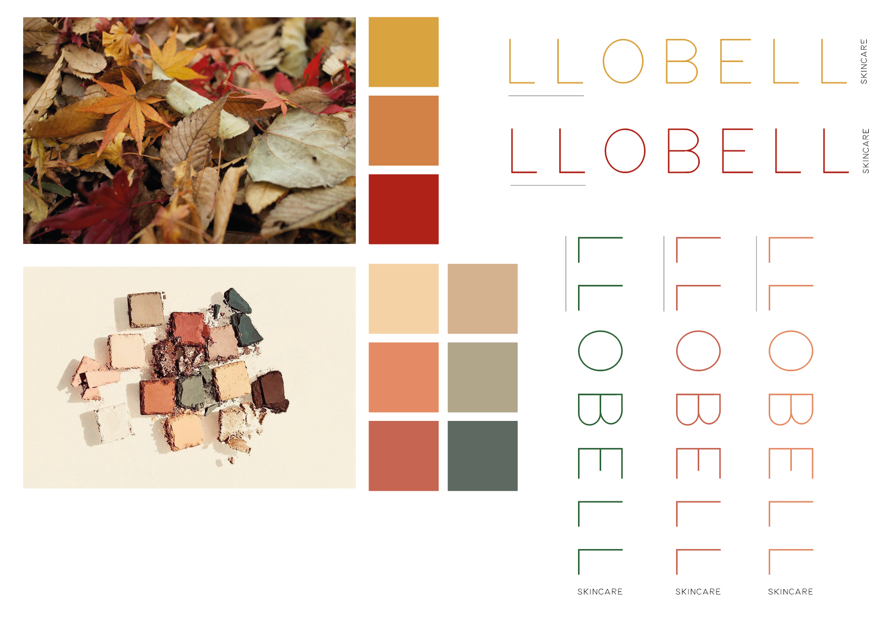
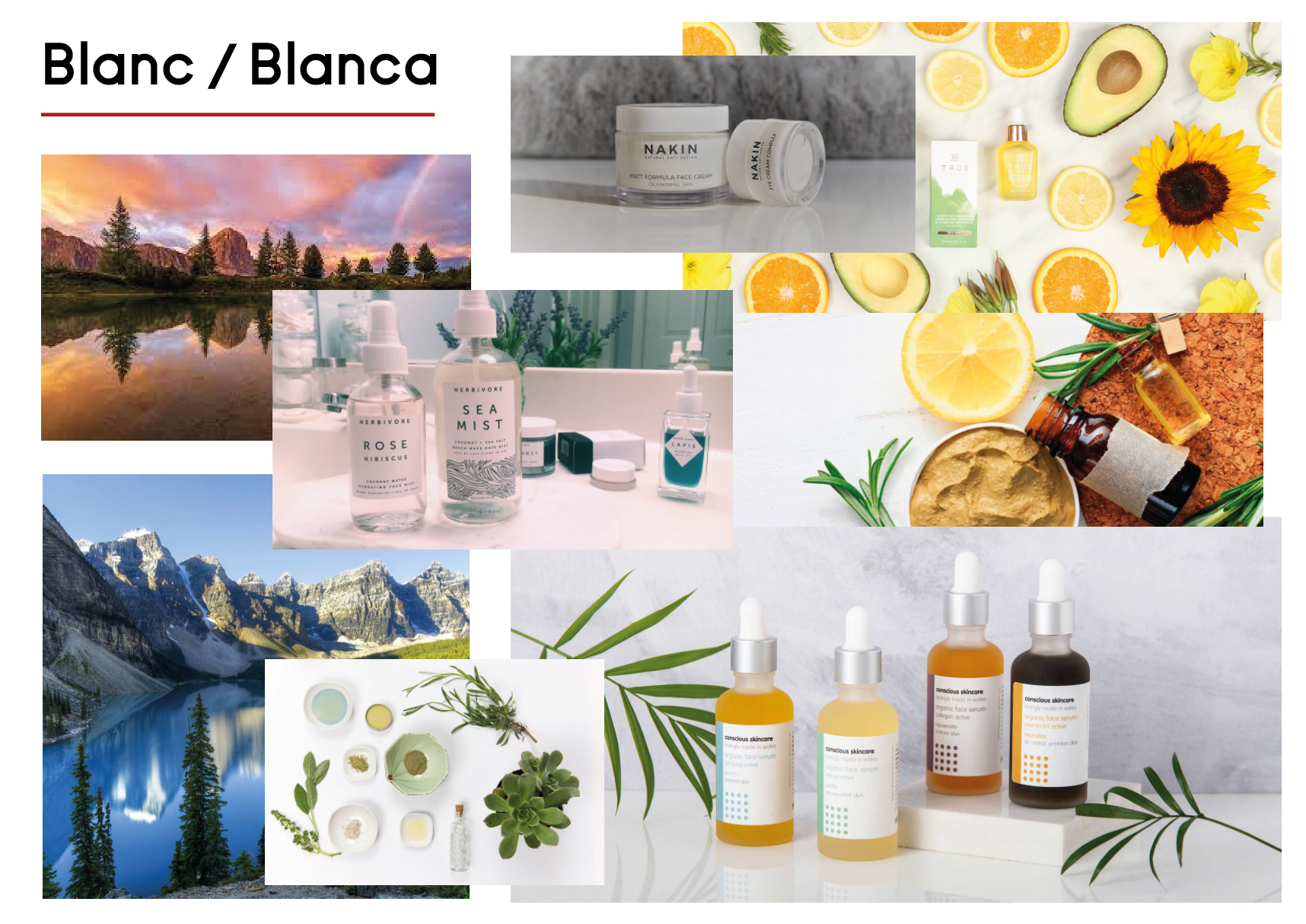
Moodboard:
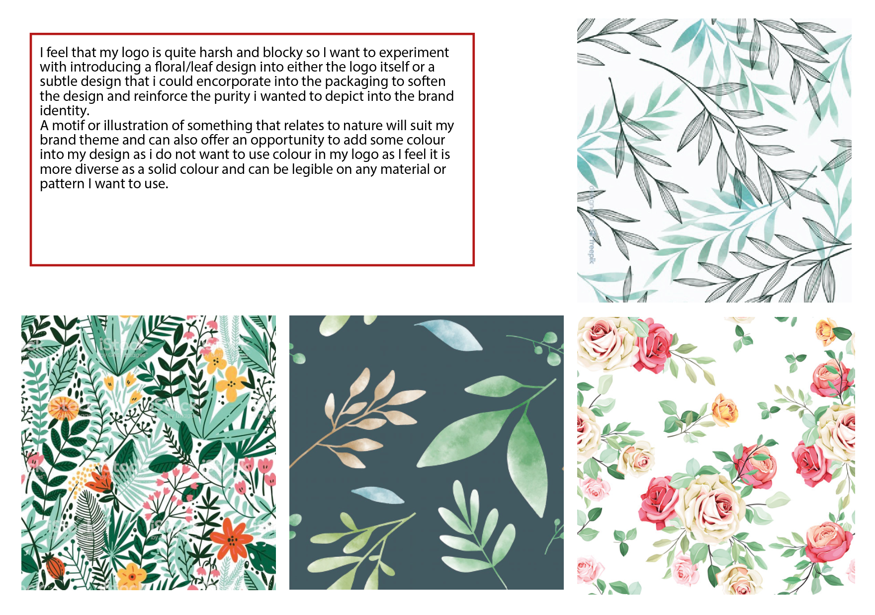
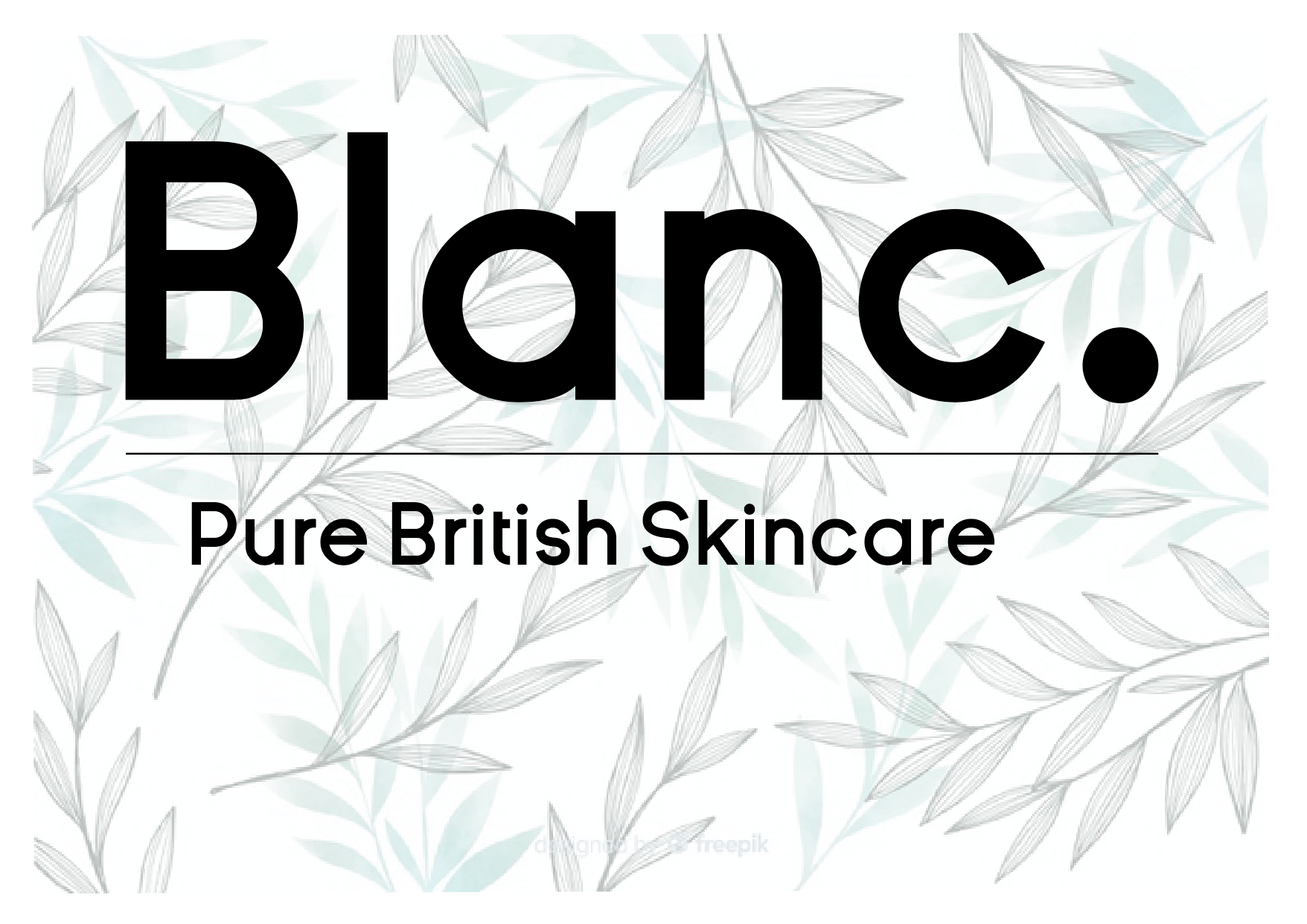
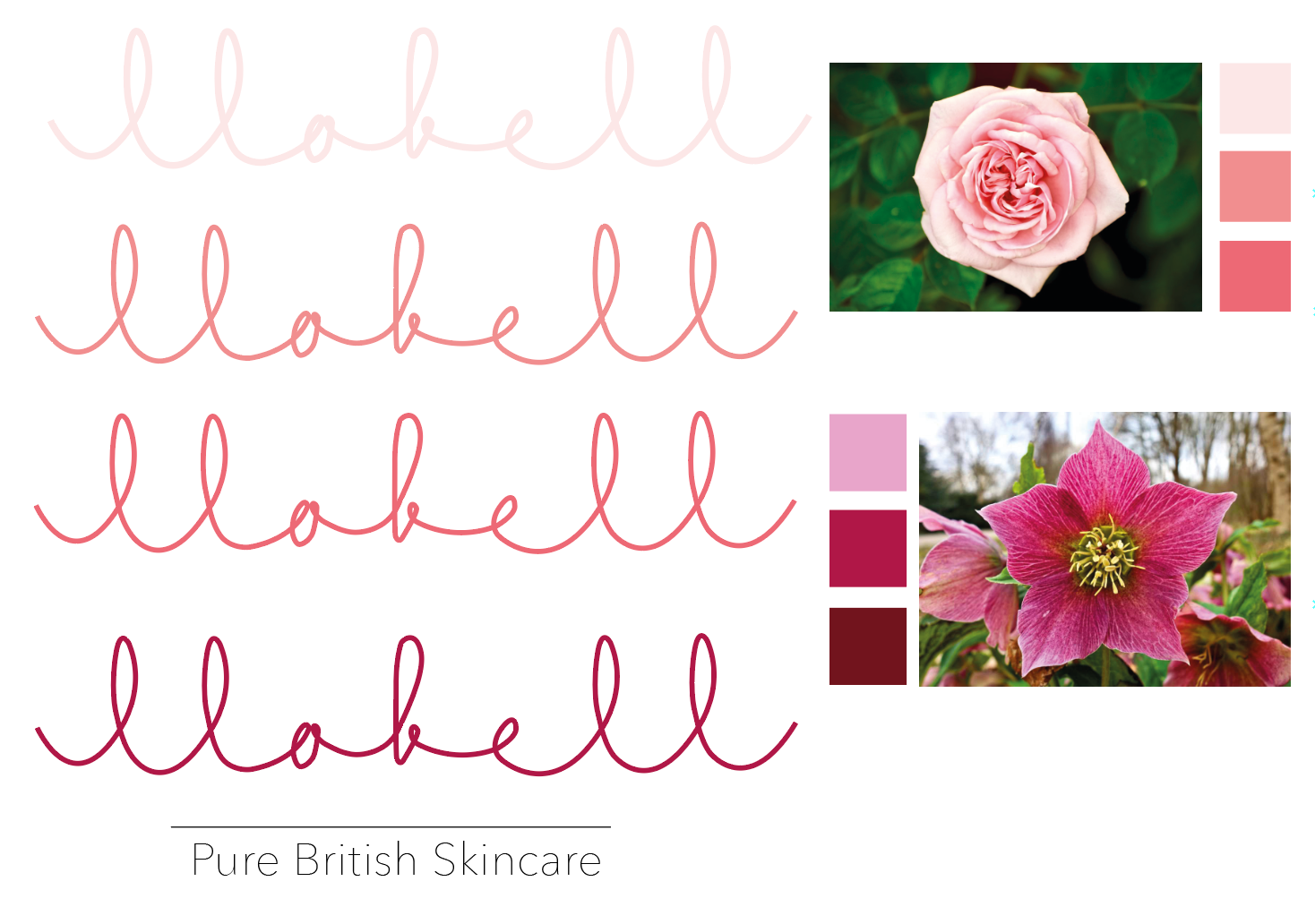
I wanted to experiment with introducing the organic, vegan, pure elements that I want to be the USP for the brand itself into the branding designs by being influences by very rural, natural colours supporting a simple light typeface.